


Did you know that over 285 million people worldwide live with visual impairments?
Your iPhone has powerful built-in features designed to make technology more accessible!
Whether you’re dealing with light sensitivity, want to reduce eye strain during late-night browsing, or simply prefer a high-contrast display, inverting colors on your iPhone can be a game-changer.
Apple’s accessibility features go far beyond basic settings – they’re sophisticated tools that can transform your entire iPhone experience.
From Classic Invert to Smart Invert, there are multiple ways to flip your screen colors and create a more comfortable viewing experience.
Let’s dive into everything you need to know about inverting colors on your iPhone and discover some amazing alternatives you might not have known existed!
Short Into
- You can invert colours on iPhone using Smart Invert or Classic Invert.
- Smart Invert preserves media while Classic Invert flips everything.
- Pair inversion with Dark Mode, Reduce White Point, or Contrast settings for maximum comfort.
- Accessibility Shortcuts make toggling faster with a triple-click.
- iOS 17 brings improved accessibility tools to enhance display personalization.
Understanding iPhone Color Inversion Features
Apple has developed two distinct color inversion options, each designed for different use cases and preferences.
Understanding these features is crucial for choosing the right solution for your needs.


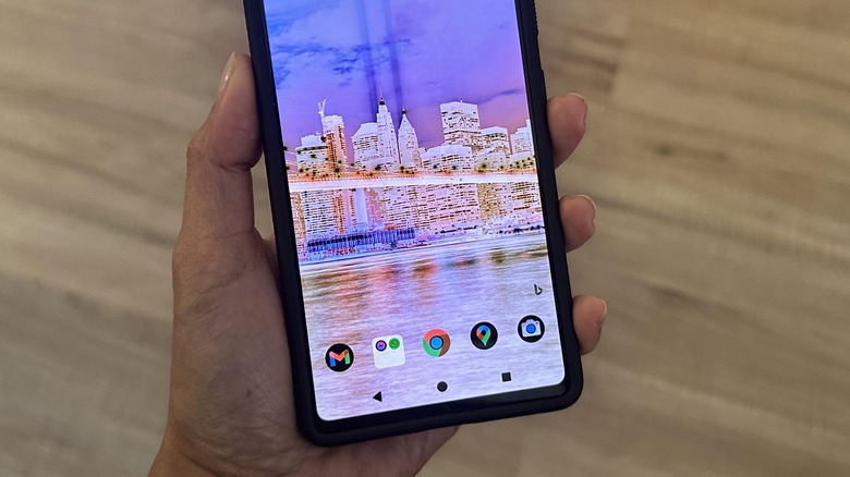
Classic Invert completely reverses all colors on your screen – white becomes black, black becomes white, and every other color transforms into its opposite on the color wheel.
This creates a true negative image effect that can be particularly helpful for users with certain visual impairments or those who prefer maximum contrast.
This means photos, videos, and app icons will also appear inverted, which might look strange or make content difficult to recognize.
Smart Invert, introduced in iOS 11, represents Apple’s more intelligent approach to color inversion.
This feature inverts colors throughout the interface while attempting to preserve the natural appearance of images, media, and some app content.
Smart Invert analyzes what’s on your screen and makes intelligent decisions about what should and shouldn’t be inverted, creating a more visually appealing experience that maintains usability.
The technical implementation of these features works at the system level, meaning they affect everything displayed on your iPhone screen.
This includes the home screen, apps, notifications, and even the lock screen.
The inversion happens in real-time, so there’s no delay when switching between apps or opening new content.
For users with visual impairments such as photophobia (light sensitivity), cataracts, or certain types of color blindness, color inversion can dramatically improve screen readability.
The high contrast created by inversion can make text more legible and reduce eye strain during extended use periods.
Using inverted colors can help conserve battery life on iPhones with OLED displays, as black pixels don’t require power to illuminate.
Smart Invert iPhone vs Classic Invert
| Feature | Smart Invert | Classic Invert |
|---|---|---|
| Photos & Videos | Stay normal | Colors inverted |
| App Icons | Normal | Colors inverted |
| Reading Text | Easier to read | High contrast but distorted visuals |
| Use Case | Eye strain reduction, reading | Strong contrast for visual impairment |
Step-by-Step Guide to Invert Colors on iPhone
Getting started with color inversion on your iPhone is straightforward, but knowing the exact steps ensures you’ll set it up correctly the first time.
Method 1: Through Settings
- Open the Settings app on your iPhone – you’ll find it on your home screen with a gray gear icon.
- Scroll down and tap Accessibility. This section contains all of Apple’s built-in accessibility features.
- Under the Vision section, tap Display & Text Size. This menu controls various visual accessibility options.
- Scroll down to find the inversion options. You’ll see two choices:
- Smart Invert Colors – Toggle this on for the intelligent inversion feature
- Classic Invert Colors – Toggle this on for complete color inversion
- Tap the toggle switch next to your preferred option. The change takes effect immediately, and you’ll notice your screen colors invert right away.
Method 2: Using Control Center (Quick Access)
For faster access, you can add color inversion to your Control Center:
- Go to Settings > Control Center
- Tap Customize Controls
- Find Accessibility Shortcuts in the “More Controls” section and tap the green plus sign
- Now you can access color inversion by swiping down from the upper-right corner (iPhone X and later) or swiping up from the bottom (iPhone 8 and earlier) to open Control Center
- Tap the accessibility icon (person in circle) and select your preferred inversion option
This method is perfect when you need to quickly toggle inversion on and off throughout the day, such as when moving between bright and dim lighting conditions.
Smart Invert vs Classic Invert: Which Should You Choose?
Choosing between Smart Invert and Classic Invert depends on your specific needs and how you use your iPhone.
Let me break down the key differences to help you make an informed decision.
Smart Invert Advantages:
Smart Invert excels at maintaining a more natural appearance while still providing the high contrast benefits of color inversion.
When you’re browsing photos in the Photos app, watching videos, or using social media apps, images and media content remain in their original colors.
This means you can enjoy inverted text and backgrounds for better readability without sacrificing the visual quality of multimedia content.
Apps that have been optimized for Smart Invert will display more naturally, with developers able to specify which elements should remain uninverted.
This is particularly useful for apps with custom interfaces or those that rely heavily on visual elements like games or creative tools.
Smart Invert also works better with app icons on your home screen, attempting to preserve their recognizable appearance while still providing the contrast benefits you’re seeking.
Classic Invert Advantages:
Classic Invert provides the maximum possible contrast by inverting absolutely everything on your screen.
For users with severe visual impairments or those who need the highest level of contrast for readability, this can be the better choice.
Some users find Classic Invert more consistent and predictable since it applies the same transformation to everything uniformly.
There are no exceptions or intelligent decisions being made – what you see is a true negative image of the original content.
Classic Invert can also be more effective in extremely bright environments where you need maximum contrast to see your screen clearly.
Compatibility Considerations:
Both features work across all modern iPhone models, but the effectiveness can vary depending on your iPhone’s display technology.
OLED displays (found in iPhone X and later Pro models) show more dramatic contrast with inversion, while LCD displays (iPhone XR, iPhone 11, etc.) provide a different but equally effective experience.
For most users, I recommend starting with Smart Invert as it provides a good balance of accessibility benefits with visual appeal.
You can always switch to Classic Invert if you need more aggressive contrast or find that Smart Invert doesn’t work well with your frequently used apps.
Setting Up Quick Access and Shortcuts
Having quick access to color inversion features is essential for users who need to toggle these settings frequently throughout the day.
Apple provides several convenient methods to access these features rapidly.
Accessibility Shortcut Setup:
The most convenient way to toggle color inversion is through the Accessibility Shortcut feature:
- Go to Settings > Accessibility
- Scroll to the bottom and tap Accessibility Shortcut
- Select either Smart Invert Colors or Classic Invert Colors (you can choose multiple options)
- Now, triple-clicking your side button (iPhone X and later) or home button (iPhone 8 and earlier) will bring up the accessibility shortcut menu
This triple-click gesture works from anywhere on your iPhone – the lock screen, within apps, or on the home screen.
If you’ve selected multiple accessibility features, you’ll see a menu to choose from. If you’ve only selected color inversion, it will toggle on and off directly.
Siri Voice Control:
You can also use Siri to control color inversion hands-free:
- “Hey Siri, turn on Smart Invert”
- “Hey Siri, turn off color inversion”
- “Hey Siri, invert colors”
This is particularly useful when your hands are occupied or when you’re using your iPhone in situations where touching the screen isn’t convenient.
Custom Shortcuts App Integration:
For power users, the Shortcuts app offers even more flexibility:
- Open the Shortcuts app
- Tap the + to create a new shortcut
- Add the action Set Accessibility Feature
- Choose your preferred inversion option
- Name your shortcut and add it to your home screen or Siri phrases
You can create multiple shortcuts for different scenarios – one for turning inversion on, another for turning it off, or even shortcuts that combine color inversion with other accessibility features.
Alternative Accessibility Features for Better Visibility
While color inversion is powerful, it’s just one of many accessibility features that can improve your iPhone experience.
Understanding these alternatives helps you create a comprehensive accessibility setup tailored to your needs.
Dark Mode Integration:
Dark Mode, introduced system-wide in iOS 13, offers a different approach to reducing screen brightness and eye strain.
Unlike color inversion, Dark Mode is designed by app developers and maintains the intended visual hierarchy while using darker color schemes.
You can use Dark Mode alongside Smart Invert for even more customization.
Many users find this combination provides the perfect balance of contrast and visual appeal, especially in low-light conditions.
To enable Dark Mode:
- Go to Settings > Display & Brightness
- Select Dark under Appearance
- Or set it to automatic based on sunrise/sunset times
Increase Contrast Settings:
The Increase Contrast feature enhances the distinction between background and foreground elements without inverting colors:
- Settings > Accessibility > Display & Text Size
- Toggle on Increase Contrast
- You’ll also find options for Reduce Transparency and Darken Colors
This feature is excellent for users who need better text readability but don’t want the dramatic change that comes with color inversion.
Reduce White Point:
This feature dims bright white backgrounds without affecting other colors:
- Settings > Accessibility > Display & Text Size > Reduce White Point
- Use the slider to adjust intensity from 25% to 100%
Reduce White Point is particularly effective for late-night use or for users sensitive to bright white backgrounds.
Text and Button Enhancements:
Several features can improve text readability:
- Bold Text: Makes all system text bolder and more legible
- Button Shapes: Adds shapes to buttons so they’re easier to identify
- On/Off Labels: Adds text labels to switches for clarity
Zoom and Magnifier Features:
For users who need content magnification:
- Zoom: Magnifies the entire screen or creates a lens effect
- Magnifier: Turns your iPhone camera into a digital magnifying glass
- Hover Text: Shows enlarged text when using external keyboards
These features can work in combination with color inversion to create a highly customized accessibility experience that meets your specific visual needs.
Extra iPhone Accessibility Features
Dark Mode vs Color Inversion
- Dark Mode changes supported apps and backgrounds to dark themes.
- Smart Invert applies changes throughout iOS, even in apps without Dark Mode support.
Combining both features gives flexibility depending on your environment.
iPhone Contrast Settings
- Increase Contrast: Makes borders sharper and elements stand out.
- Reduce Transparency: Improves text legibility on blurred backgrounds.
- Reduce White Point: Lowers bright intensity, making the screen easier on eyes.
Color Filters iPhone
For users with color blindness, filters help distinguish shades. Options include grayscale, red/green, blue/yellow adjustments.
Magnifier Features
Your iPhone’s camera can turn into a magnifying lens using the built-in Magnifier App (enabled in Accessibility).
iOS 17 Accessibility Updates
Apple continues to prioritize accessibility with each iOS version. In iOS 17:
- Refined Smart Invert improves media handling.
- New Magnifier tools enhance usability.
- Expanded Accessibility Shortcuts allow faster toggling of features.
If you recently updated, explore Settings > Accessibility for refreshed options.
Troubleshooting Common Color Inversion Issues
Even with Apple’s refined implementation, you might encounter some challenges when using color inversion.
Understanding these common issues and their solutions will help you get the most out of these accessibility features.
App Compatibility Problems:
Some apps don’t play well with color inversion, particularly older apps that haven’t been updated for newer iOS versions.
You might notice strange color artifacts, unreadable text, or interface elements that become completely invisible.
Solutions:
- Try switching between Smart Invert and Classic Invert to see if one works better with problematic apps
- Check the App Store for updates to problematic apps
- Use the triple-click shortcut to quickly disable inversion when using problematic apps
- Contact app developers to request better accessibility support
Screen Recording and Screenshot Issues:
When color inversion is enabled, your screenshots and screen recordings will capture the inverted colors, which might not be what you want when sharing content with others.
Solutions:
- Disable color inversion before taking screenshots or recording
- Use the quick toggle methods we discussed to rapidly switch inversion on and off
- Edit screenshots afterward using the Photos app’s editing tools to restore natural colors if needed
Website and Web Content Problems:
Some websites don’t display correctly with color inversion, particularly those with complex layouts or custom color schemes.
Solutions:
- Try Safari’s Reader View for articles and blog posts
- Use website dark modes when available instead of system-wide inversion
- Consider using dedicated apps instead of web versions for frequently visited sites
Getting Stuck with Inverted Colors:
Sometimes users accidentally enable color inversion and can’t figure out how to turn it off, especially when the interface looks completely different.
Solutions:
- Remember the triple-click shortcut – this works even when colors are inverted
- The Settings app location remains the same: Settings > Accessibility > Display & Text Size
- Ask Siri to “turn off color inversion” if you’re completely lost
- Force restart your iPhone if all else fails (this won’t disable the setting but will give you a fresh start)
Performance and Battery Considerations:
While color inversion generally doesn’t impact performance, some users report slight battery differences, particularly with Classic Invert on OLED displays.
Solutions:
- Monitor your battery usage in Settings > Battery to see if inversion is affecting your device
- Consider using Smart Invert instead of Classic Invert for better battery optimization
- Combine with Low Power Mode if battery life is a concern
Advanced Tips and Customization Options
Once you’re comfortable with basic color inversion, these advanced techniques can help you create an even more personalized and effective accessibility setup.
Combining Multiple Accessibility Features:
Color inversion works exceptionally well when combined with other accessibility features. Here are some powerful combinations:
For Maximum Contrast:
- Classic Invert + Increase Contrast + Bold Text
- This combination provides the highest possible contrast for users with severe visual impairments
For Comfortable Night Use:
- Smart Invert + Dark Mode + Reduce White Point
- Perfect for late-night browsing with minimal eye strain
For Reading-Focused Use:
- Smart Invert + Larger Text + Button Shapes
- Ideal for users who primarily use their iPhone for reading and communication
Creating Situation-Specific Shortcuts:
Use the Shortcuts app to create complex automation:
- Create a “Night Mode” shortcut that enables Smart Invert, reduces white point to 75%, and turns on Do Not Disturb
- Create a “Reading Mode” shortcut that combines inversion with increased text size and bold text
- Set up location-based automation that automatically enables inversion in bright outdoor locations
Gaming and Entertainment Optimization:
For users who game or watch videos frequently:
- Create quick shortcuts to disable inversion for entertainment apps
- Use Smart Invert primarily to maintain media quality
- Consider app-specific workarounds for games that don’t support inversion well
Professional and Productivity Use:
If you use your iPhone for work:
- Set up shortcuts that quickly switch between inverted and normal modes for presentations
- Use Smart Invert to maintain document readability while preserving image quality
- Create time-based automation that enables inversion during work hours
Color Filter Integration:
iOS also offers color filters for users with color blindness or other color perception issues. These can be combined with inversion:
- Settings > Accessibility > Display & Text Size > Color Filters
- Choose from filters for Protanopia, Deuteranopia, Tritanopia, or create custom tints
- Combine with Smart Invert for unique color combinations that work for your specific vision needs
Developer and Beta Testing:
For developers or beta testers, color inversion can help identify accessibility issues in apps and websites. Use it as a testing tool to ensure your own projects work well with accessibility features.
FAQ
Q1: What is the difference between Smart Invert and Dark Mode?
Dark Mode changes themes where supported, while Smart Invert impacts the entire system, including unsupported apps.
Q2: Does color inversion save battery on iPhone?
Not directly. OLED displays may use less power with Dark Mode, but inversion’s impact is minimal.
Q3: Can I set up multiple accessibility shortcuts?
Yes. In Accessibility Shortcuts, you can assign multiple features and switch between them with triple-click.
Q4: Will inverting colors affect screenshots?
No. Screenshots capture the normal display colors, even if inversion is enabled.
Q5: Is color inversion the same as color filters?
No. Inversion changes overall colors, while filters help users with color blindness distinguish hues.
Conclusion
Mastering iPhone color inversion opens up a world of accessibility and comfort that many users never explore.
Whether you’ve chosen Smart Invert for its media-friendly approach or Classic Invert for maximum contrast, you now have the tools to customize your iPhone experience perfectly!
Remember, these features aren’t just for users with visual impairments – they’re powerful tools for anyone looking to reduce eye strain, save battery life, or simply try something new.
The combination of quick access methods, from triple-click shortcuts to Siri voice commands, means you can adapt your display to any situation in seconds.
Don’t forget to explore the other accessibility options we’ve covered, as combining multiple features often creates the most comfortable viewing experience.
The beauty of iOS accessibility lies in its flexibility – you can create a setup that’s uniquely tailored to your needs, preferences, and daily usage patterns.
Ready to make your iPhone work better for you?
Start with the basic inversion steps we’ve outlined, then experiment with the advanced customization options.
Your eyes will thank you, and you might just discover a whole new way to enjoy your device!
Take a moment today to try both Smart and Classic Invert, set up your quick access shortcuts, and explore how these features can enhance your daily iPhone experience.

Virginia J. Alfonso is a seasoned technology writer with a passion for all things digital. With over a decade of experience covering the latest in tech innovation, gadgets, and software, Virginia brings a unique blend of technical expertise and accessible writing to her work. Her articles focus on making complex tech topics easy to understand for readers of all levels.


